Now we know what is problem management, how to define it, Identified it and its elements. Let’s understand the Method to solve them. 7QC tools are play very important roles in solving the problem.
Japanese quality expert Dr. Kaoru Ishikawa had first compiled and popularized these tools and have since been widely adopted in various industries worldwide.
According to Dr. Kaoru Ishikawa “Success does not depend on the application of complex techniques, but on the number of employees trained in the use of simple techniques.”

What are 7QC tools
The 7QC (Quality Control) tools, aka the 7 basic Tools of Quality management are a set of techniques and graphical tools used in project quality management and process improvement.
Below are these 7 QC tools:
- Check sheet
- Pareto Chart
- Cause-and-Effect Diagram (Fishbone or Ishikawa Diagram)
- Stratification
- Scatter Diagram
- Histogram
- Control Chart
Let discuss these tools:
-
Check sheets:
This is 1/7 QC tool. It is a method that allow organization to collect the data in an organized & Structured way and group them in categories. Check sheets are used as data gathered and clarification tools as:
- Identify the problem that occur
- Determine the severity of the incidence
- Found the cause (s) of problem
- Found the location and extent of problem
- Keep tracker of ongoing process of parameters
Creation of Check sheets
Below are the steps which needs to follow during creation of check sheet
- Decide the purpose of collection of data
- Decide type of data needs to collect
- Select the time period over which data needs to be collected
- Prepare a templet of from for collect the required data
- Collect the data
- Interpret the data
Type of Check sheets
- Error Check sheet: list down the kind of defect that occur
- Cause check sheet: list down the causes of the problems and the frequency
- Production process distribution check sheet: record the dispersion of the value of the parameter to be controlled.
- Inspection Check sheet: what are parameters are used to inspect the problem
- Location Check sheet: location of the problem on the drawing
-
Pareto’s Analysis
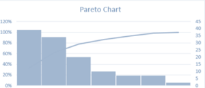
This is 2/7 QC tool. The main objective of Pareto Analysis is to categorize and prioritize the vital few features or causes that have the most important influence or contribute the most to a given condition. The analysis helps assign resources and efforts proficiently by focusing on the aspects that produce the required results.
Pareto Analysis, also known as the 80/20 rule or Pareto principle. It is named after the Italian economist Vilfredo Pareto, who observed that roughly 80% of the effects come from 20% of the causes.
For Example:
- 80% of sale happens due to 20% of important Items.
- 80% accidents happen on 20% road
- 80% work will be completed because 20% team members’ hard work
- 80% people follows 20% success people
- 20% of the employe create 80% issues
Steps to conducting Pareto Analysis
- Define the problem or outcome
- Collect data
- Categorize the data
- Calculate frequencies or counts
- Calculate the cumulative frequency
- Plot the Pareto chart
- Analyse the chart:
- Focus on the vital few
3. Ishikawa Diagram
This is 3/7 QC tool. When we identified the problem and its causes then we need to start work on resolve the issue and take preventive action to avoid or minimize the Risk of re-accruing.
Ishikawa is such a tool which helps to present and analysis the problem and causes in systemic manner.
An Ishikawa diagram is also known as “Cause and effect” Diagram or the Fish bone diagram ( as per his shape). This tool was developed by Dr. Kaoru Ishikawa, a professor in Tokyo University.
How to use or Drawn Ishikawa Diagram
As we discussed above that this diagram is looks like a Fish or Fish bone. So below is sample Diagram to understand it better.

Benefits of Ishikawa tools:
- Visual representation:
- Systematic analysis
- Categorization of main causes of problem
- Categorization of Sub-Causes of reason of main Cause of the problem
- Root cause identification
- Prioritization of efforts
- Data-driven decisions
- Continuous improvement:
- Root cause analysis
- Problem prevention:
4. Stratification
This is 4/7 QC tool. Stratification is process or tool which is use to segregating or regrouping the data on the same basis of issue/problem and certain parameter.
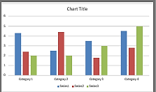
Let understand with below some examples:
Complaints can be Categorized or segregated by,
- Nature of Complaints (Team behavior, SLA, not responded on time, delayed in delivery etc.)
- Domain responsible (Design, management, Billing, Shipment etc)
- Impact (Who is impacted or production impacted)
- Criticality (Low, Medium, High, Who complaints to whom, Level of complaint or escalation)
- Area of complaints
- Quality Complaints
Benefits of Stratification
- Improved accuracy
- Identification of patterns
- Targeted improvements
- Efficient resource allocation
- Better decision-making
5. The Scatter Diagram
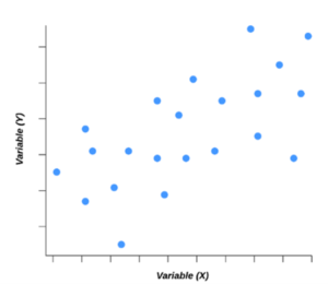
This is 5/7 QC tool. The Scatter Diagram, also called “Correlation Diagram”. It is a graphically representation between two variable or two set of data. It is used to inspect the relationship between two variables and to identify any outlines or correlations between them. They are concerned about the relationship between the production speed (variable X) and the number of defects in the products (variable Y).
Use of Scatter Diagram
It is used for:
- Visualizing relationships:
- Identifying correlations
- Data exploration
- Detecting outliers
- Assessing trends and patterns
- Making predictions
- Evaluating cause-and-effect relationships
- Quality control and process improvement
- Supporting hypothesis testing
Commonly Occurring correlation
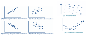
There are Six Commonly Occurring correlation in Scatter Diagram:
- Strong Positive Correlation
- Strong Negative Correlation
- Weak Positive Correlation
- Weak Negative Correlation
- Curvilinear Correlation
- No Correlation
- Positive Correlation: is said to exist when the value of “Y” increases, then ‘X’ Value increase as well or If the data that rises from left to right in graph, it indicates a positive correlation.
- Negative Correlation: it said to exit when the value of “Y” decreases, then ‘X’ Value increase or If that falls from left to right in graph, it indicates a negative correlation.
- Curvilinear Correlation: this means when there is a positive or negative correlation up to a certain level which later become negative or positive respectively.
- No Correlation: is said to exist when the Value of “Y” does not appear to increase or decrease, with increases within a range of ‘X’ value, it indicates no correlation between the ‘X’ & ‘Y’.
6. Histogram
This is 6/7 QC tool. It is a graphical representation of the numerical data. It delivers a visual summary of the frequency or count of data values that fall within specified intervals, known as bins.
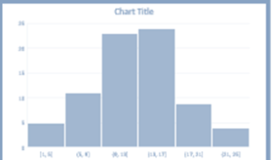
Use of Histogram
Histograms are commonly used in
- Statistics,
- Data analysis,
- Quality control to understand the original delivery of a dataset and identify shapes and trends.
- Identifying the shape of the data distribution
- Detecting outliers or extreme values in the dataset.
- Comparing the distributions of different datasets.
- Visualizing the frequency of data within specific intervals.
- Understanding patterns and trends in the data
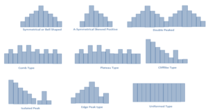
Shapes or type of Histogram
- Symmetrical or Bell Shaped
- Asymmetrical Skewed Positive
- Double peaked
- Comb Type
- Plateau Type
- Clifflike (Truncated) type
- Isolated Peak Type
- Edge Peaked Type
- Graphs
- Flow Charts
7. Control Chart
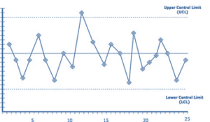
A Control Chart, also known as a Shewhart chart or process-behavior chart, is one of the 7QC (Quality Control) tools. It is a graphical method validating the stability of the process over time.
The primary purpose of constructed a control chart when special causes have been eliminated and variability. This differentiation is crucial in quality management because common cause variation represents the natural fluctuations that occur within a stable process, while special cause variation signifies that the process has undergone a significant change or disruption that requires investigation and corrective action.
FAQ
Q: What are the 7QC (Quality Control) tools?
A: The 7QC tools are a set of techniques used for data analysis and problem-solving in quality management. They are:
- Check Sheet,
- Histogram,
- Pareto Chart,
- Cause-and-Effect Diagram (Fishbone or Ishikawa Diagram),
- Scatter Diagram,
- Control Chart, and
Q: Why are the 7QC tools essential in quality management?
A: The 7QC tools help organizations identify and analyze the root causes of quality-related issues, make data-driven decisions, prioritize improvement efforts, and monitor process stability.
Q: What is the Pareto Chart?
A: The Pareto rule, also known as the 80/20 rule, states that roughly 80% of the effects come from 20% of the causes, like 80% production will be come from 20% employee same 80% problems will be created by 20% of employees.
Q: How is a Scatter Diagram useful in data analysis?
A: Scatter Diagrams are used to examine the relationship between two variables. They help determine if there is a correlation or causation between the variables and provide insights into the strength and direction of the relationship.
Read More : https://techblog.kbrosistechnologies.com/
Visit to our site : https://www.kbrosistechnologies.com/
Watch more Video https://www.youtube.com/channel/UCpcd6IshE1caAbf9EdJd3gw

